Your AI-Generated Marketing Graphics Look Like Everyone Else’s. And That’s a Problem.
AI-generated marketing graphics increasingly look like everyone else’s because a generic request to artificial intelligence (AI) gives you a generic result. That’s a problem: if your graphic looks like your competitors’ advertising, people won’t stop scrolling, understand your message or take action.
Key takeaways
- Generic AI prompts produce predictable, look-alike graphics, and your advertising shouldn’t look like your competitors’.
- Effective promotional graphics lead with one customer benefit, a clear visual hierarchy and one specific call to action.
- Give AI a creative brief covering your buyer, business objective and brand, rather than a vague request for something eye-catching.
- Human review still matters: verify every claim, check readability on a phone and measure results that reflect real buyer action.
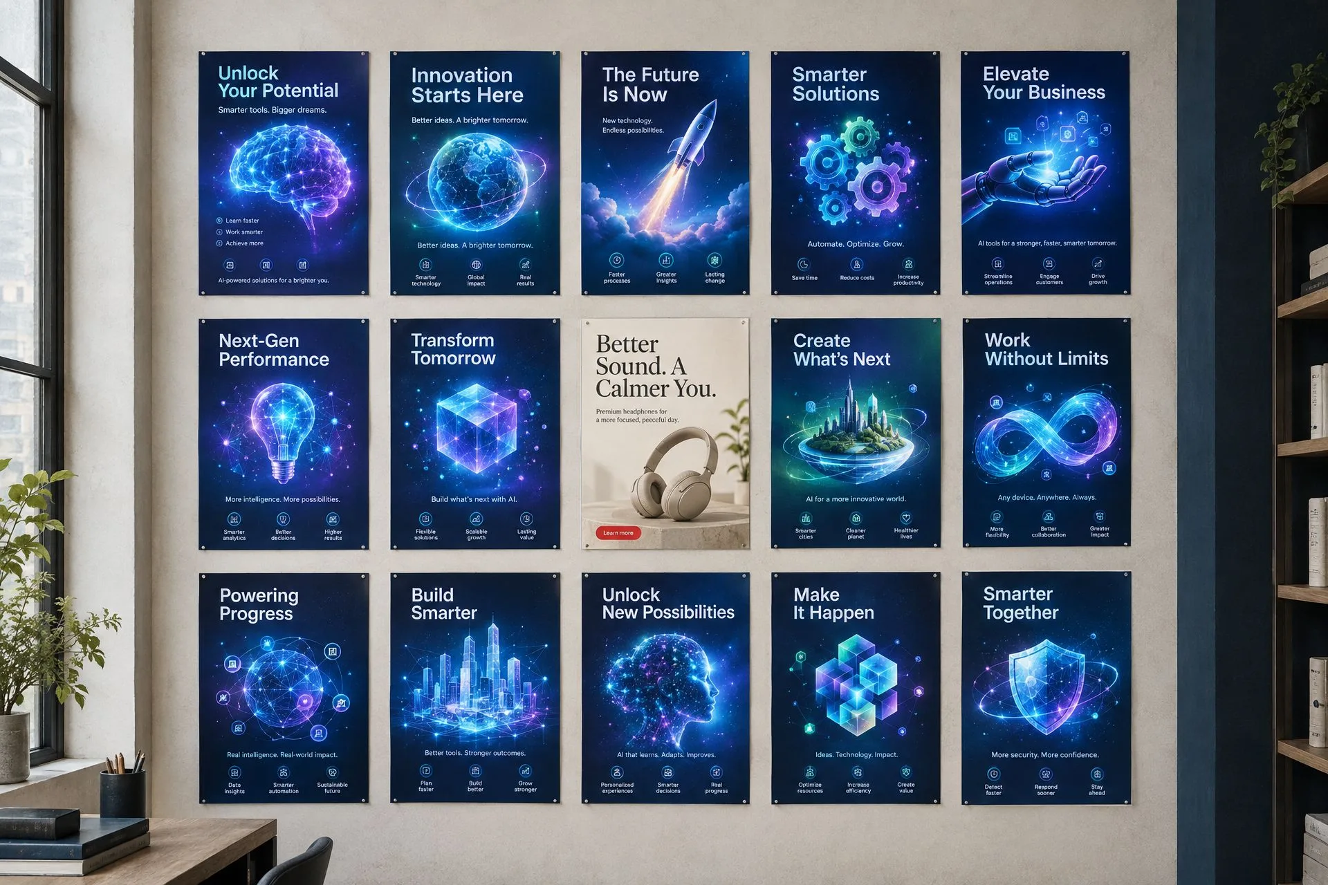
Open LinkedIn, Instagram or Facebook lately, and you’ll probably notice that more and more promotional graphics look suspiciously similar. The same glowing gradients. The same floating icons. The same overly polished imagery. The same enormous headlines surrounded by so much information that you don’t know where to look first. And, of course, there are those event promotions that somehow squeeze an entire brochure onto one social media graphic.

You can almost hear the prompt: “Create an eye-catching, professional promotional graphic and include all these details.” AI happily obliges.
The result might look impressive at first glance. But impressive isn’t necessarily effective.
Tools like ChatGPT Images, Claude Design, Canva, Adobe Express and other AI-powered platforms have made creating marketing materials faster and more accessible than ever. That’s a good thing. I use AI, too. But there’s a growing problem with treating a generated graphic as a finished piece of marketing simply because it looks polished.
We’ve become very good at producing content. We haven’t necessarily become better at communicating.
Why do AI-generated graphics all look the same?
When you give AI a generic request, don’t be surprised when it gives you a generic result. Ask for a professional industrial product advertisement, and you might get metallic lettering, electric-blue lighting, hexagonal backgrounds, floating gears and a list of impressive-sounding benefits. Ask for a corporate event poster, and suddenly everyone is networking beneath dramatic spotlights, surrounded by glowing circles and inspirational slogans.
The designs aren’t necessarily terrible. They’re just increasingly predictable, and that’s not entirely subjective. A 2026 research review examining 19 studies found that using generative AI was associated with a small but statistically significant tendency toward more homogeneous creative outputs. In other words, AI may help people produce creative work, but it can also steer them toward similar ideas.
Why it matters
Your competitors already offer similar products, services or solutions. The last thing you need is for your advertising to look like theirs, too.
Why do AI-generated marketing graphics fall flat?
Most fall flat because they try to say everything, promote features instead of solving problems, hide the brand behind an AI aesthetic and ignore the actual buyer. Here are the real reasons.
1. Everything is competing for attention, so nothing wins
A common mistake is asking AI to include everything: the product name, six features, four benefits, three icons, a tagline, a website address, a phone number, a QR code, a call to action and, because there’s still some space, another inspirational headline. What you get looks more like a crowded PowerPoint slide than an advertisement.
Good marketing establishes a visual hierarchy, a clear order in which the audience notices and processes information. Research from the Nielsen Norman Group reinforces how important visual hierarchy is in helping people understand what matters most.
Remember
If every message is given equal emphasis, you’ve effectively made every message less important. A promotional graphic isn’t supposed to communicate everything about your product, only enough to make someone want to learn more.
2. The graphics promote features instead of solving problems
AI loves words like innovative, reliable, industry-leading, precision-engineered, superior quality and cutting-edge. They sound impressive. But what do they actually tell your customers?
Imagine you’re promoting a machined plastic conveyor component made from UHMW-PE (ultra-high-molecular-weight polyethylene). An AI-generated graphic might lead with a headline that’s technically accurate but not particularly compelling. A benefit-led headline talks about something a production manager actually cares about:
Describes the product
“High-Performance UHMW-PE Conveyor Components”
Communicates a benefit
“Less Friction. More Uptime.”
The first message describes the product. The second communicates a potential business benefit. Of course, any performance claim must be supported by the actual product.
Features tell people what you sell. Benefits explain why they should care.
3. The brand disappears behind the AI aesthetic
You can often identify an AI-generated graphic before you recognize the company that posted it. That’s a branding problem. Too many businesses accept whatever colors, typography, textures and visual elements AI generates, even when they bear little resemblance to their established brand identity.
Your logo isn’t your entire brand. Your photography, typography, layout, visual style, color palette and tone all contribute to how people recognize your business.
Try this test
Remove the logo from your AI-generated graphic. Would anyone still recognize it as belonging to your company? If the answer is no, you’re probably creating content rather than building brand recognition.
4. The design isn’t created for the actual buyer
This is one of the biggest problems, especially in B2B (business-to-business) and industrial marketing. A purchasing manager, plant manager, engineer and business owner can all be involved in buying the same product, but their priorities aren’t necessarily the same:
- Engineers may care about material performance, tolerances and application suitability.
- Plant managers may care about equipment reliability and maintenance.
- Purchasing managers may focus on lead times, supplier responsiveness and total cost.

Yet AI often generates the same generic “industrial innovation” imagery regardless of whom the advertisement is targeting.
If your graphic could be used to sell almost anything to almost anyone, it’s probably not doing enough to sell your specific product to your specific buyer.
5. The polished imagery can actually undermine credibility
AI-generated products can look beautiful. Unfortunately, they can also look physically impossible. In industrial advertising, you might see machinery with questionable geometry, unrealistic components, improper connections or materials used in ways that would never work in an actual facility. To someone unfamiliar with the industry, it looks impressive. To an engineer or experienced plant manager, it may look ridiculous. The same issue applies to fabricated testimonials, invented certifications, unsupported performance claims and misleading product representations.
Best practice
If you’re promoting a real product, start with real product photography, CAD (computer-aided design) images or accurate technical references whenever possible. AI can help create the composition and background without inventing what your product actually looks like. Trust is far more valuable than futuristic lighting effects.
6. The text is too small for the platform
Something that looks perfectly readable on a large monitor can become nearly impossible to decipher on a phone. AI is particularly good at filling empty areas with tiny descriptive text, icons and secondary headlines. But your social media audience isn’t viewing your graphic in a design presentation. They’re scrolling. Baymard Institute’s mobile usability research has documented problems with illegible text embedded in images, including readability and accessibility issues.
Social graphics, event posters, advertisements and printed materials also serve different purposes. An event poster displayed at a venue can contain more logistical information than a social media teaser designed to generate registrations. Trying to use one design for every situation often compromises all of them.
7. The call to action becomes an afterthought
A graphic might be visually impressive and still fail at the most basic marketing objective: telling people what to do next. Generic calls to action like “Discover More,” “Learn More” and “Explore Our Solutions” aren’t inherently wrong, but they often lack purpose. Match the next step to what you’re promoting:
- Technical product: request a sample, download specifications or speak with an application specialist.
- Event: register now.
- Consulting service: book a discovery call.
Make the next step specific, visible and appropriate for the buyer’s level of interest. And remember, a graphic that looks like it contains a button isn’t automatically clickable. The actual post, advertisement or landing page still needs a working path to conversion.
8. We’ve created a new kind of visual wallpaper
People have become very good at filtering out things that look like advertisements. The Nielsen Norman Group’s research on banner blindness explains how people learn to ignore familiar advertising treatments, sometimes overlooking useful content in the process. Now imagine what happens when more businesses use similar visual formulas: another glowing background, another crowded headline, another generic stock-style executive, another row of colorful feature icons.
The design may be attractive, but it doesn’t interrupt the pattern. It becomes background noise. That doesn’t mean AI-generated graphics automatically receive less engagement. It means a familiar, undifferentiated design gives people fewer reasons to pay attention, and attention is the first step toward a conversion.
9. Nobody is questioning the output
Perhaps the biggest issue isn’t AI at all. It’s the absence of a proper creative review. AI generates something, the user thinks it looks good, and the graphic gets published. Nobody asks whether the message is meaningful, the imagery is credible, the brand is recognizable or the audience has a reason to respond.
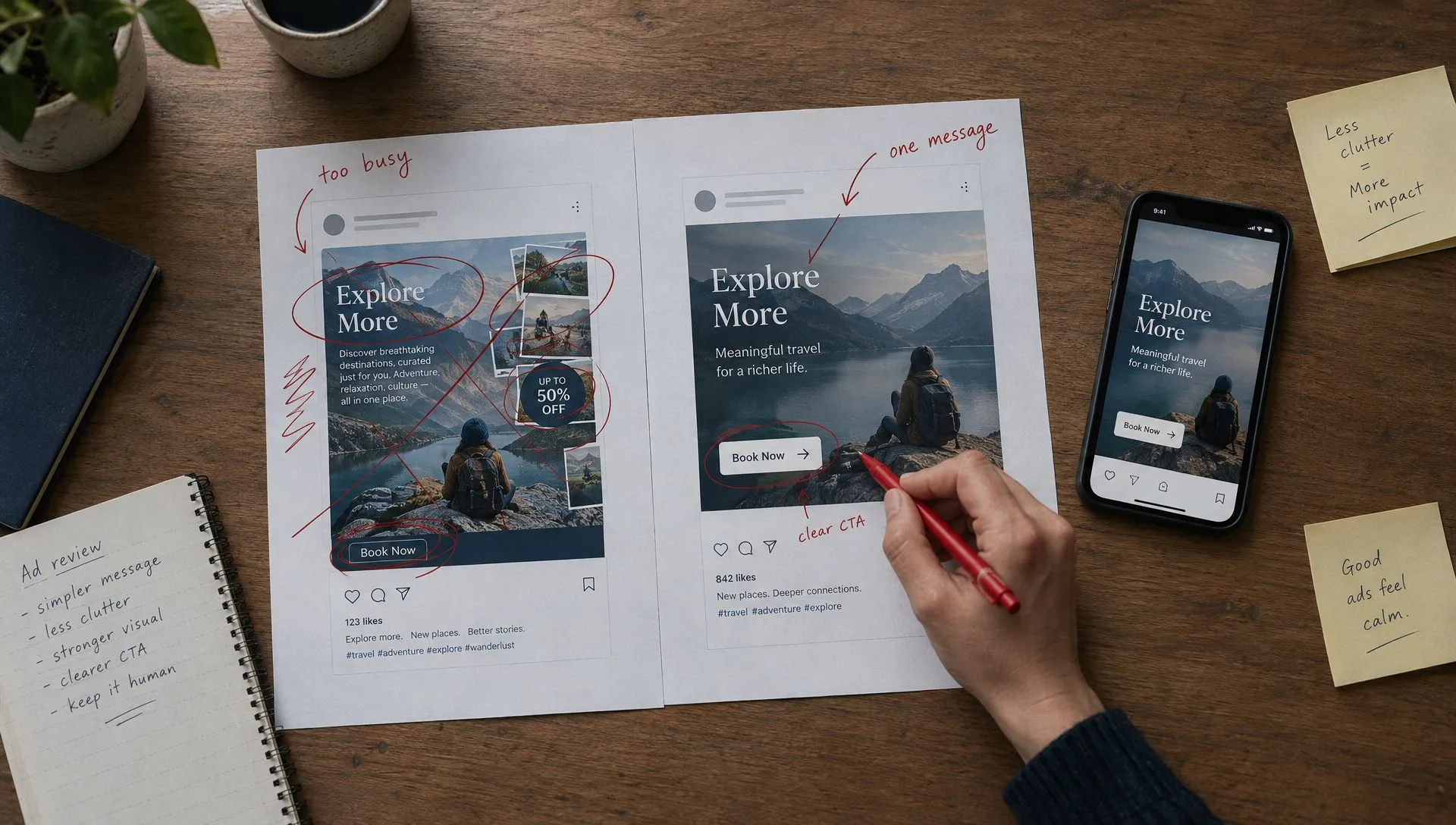
We used to expect designers and marketers to defend their creative decisions. Why that headline? Why that image? Why those colors? Why that call to action? Those questions matter just as much when AI creates the first draft.
What is the difference between generating a graphic and creating marketing?
Generating a graphic starts with design. Creating marketing starts with the target buyer and the business objective, and the design follows from them. Let’s look at an example: a fictional industrial company, Meridian Components, is launching EdgeGlide 400, a UHMW-PE conveyor wear strip. The objective is to generate sample requests from plant managers and maintenance professionals.
The typical AI approach
The generic prompt
“Create a professional, eye-catching promotional graphic for EdgeGlide 400. Highlight its features and benefits. Make it look innovative, high-tech and impressive.”
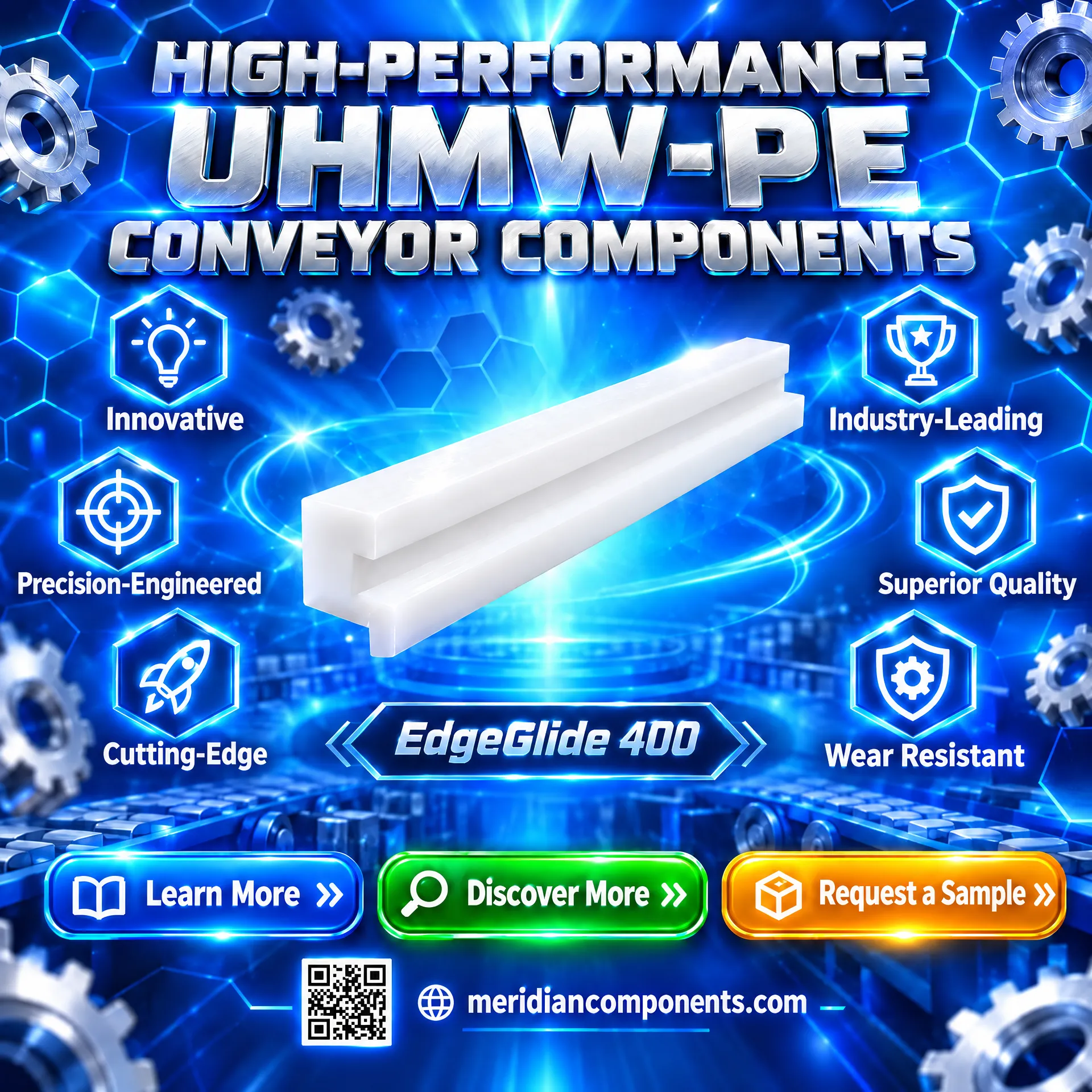
What happened? AI interpreted eye-catching as more visual effects, professional as polished corporate design, and features and benefits as an invitation to include everything. The image is overflowing with information. The branding is unclear, the product competes with decorative elements, and several possible actions compete for attention.
Now, the strategic approach
Instead of starting with design, we start with the target buyer and the business objective. The buyer is a plant or maintenance manager whose concern is keeping production moving. The product is a UHMW-PE conveyor wear strip. We want qualified buyers to request a sample. The creative direction becomes considerably simpler:
- Primary message: Less Friction. More Uptime.
- Supporting information: EdgeGlide 400 | UHMW-PE wear strips
- Call to action: Request a Sample
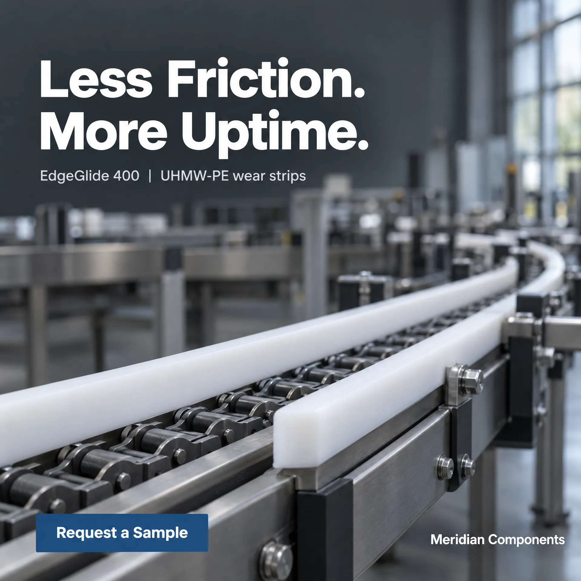
The result is cleaner, more recognizable and easier to understand. It focuses attention on one outcome, gives the product a clear identity and makes the desired next step obvious. It is not proof of a higher conversion rate; that still requires testing. But it is a much stronger application of established marketing principles.
How do you prompt AI to create better marketing graphics?
Provide a creative brief rather than a vague request: have AI think like a marketing strategist first, then create the graphic with clear design constraints, then critique its own work. You don’t need to abandon AI. You need to stop asking it to be your entire marketing department in a single prompt.
This works whether you’re using ChatGPT, Claude Design, Canva or Adobe Express. For tools that specialize in design planning instead of photographic image generation, use the brief to develop the visual direction, then execute it in the appropriate image or design application.
Prompt 1: Make AI think like a marketing strategist first
Use this before requesting an image.
Copy-and-use prompt: strategist first
You are a senior B2B marketing strategist and creative director, not just a graphic designer.
I need a promotional graphic for [product, service or event]. Our target audience is [specific buyer and industry]. Their biggest challenge is [problem]. Our solution delivers [specific, verified benefit]. The objective of this graphic is to [desired measurable action].
Our brand personality is [brand characteristics]. Our colors and fonts are [brand specifications].
Before developing any design, recommend three different creative concepts. For each, provide one compelling customer-focused headline, one supporting message, one clear call to action and a visual concept that differentiates us from competitors.
Avoid generic marketing clichés, unnecessary text, excessive icons, futuristic effects and anything that doesn’t support the primary message.
Challenge my assumptions if the content is too crowded or the benefit isn’t clear. Recommend the strongest concept and explain why.
Prompt 2: Create the graphic with clear design constraints
Once you’ve selected the concept, use a prompt like this:
Copy-and-use prompt: design constraints
Create a professional promotional graphic based on the approved creative concept.
Audience: [target market and buyer]
Primary business objective: [action you want users to take]
Format: [dimensions and intended platform]
Primary headline: ‘[exact headline]’
Supporting text: ‘[exact supporting text]’
Call to action: ‘[exact CTA]’
Brand colors: [HEX codes]
Typography: [approved fonts or typeface style]
Visual direction: Use realistic, industry-accurate photography or product imagery. Create one strong focal point and establish a clear visual hierarchy.
Design requirements: Use generous negative space, strong contrast and large, readable typography. Prioritize the benefit over the list of product features. Make the branding recognizable without dominating the message.
Do not add any text, icons, claims, specifications, badges, slogans or visual elements that I have not requested. Avoid excessive gradients, glowing objects, floating elements, fake interface graphics, generic stock-photo compositions and unnecessary decoration.
The graphic must remain easy to understand when viewed on a smartphone. Ensure the intended message is understandable within a few seconds. Leave details that don’t need to be on the graphic for the accompanying caption or landing page.
Tip
For actual products, also provide accurate reference photographs and prohibit changes to the product’s geometry or characteristics.
Prompt 3: Make AI critique its own work
This step is frequently skipped.
Copy-and-use prompt: creative director review
Act as an experienced creative director reviewing this promotional graphic before publication. Evaluate it from the perspective of our target buyer, not the person who created it.
Assess the strength of the main message, differentiation from competitors, brand consistency, visual hierarchy, text readability on mobile, technical accuracy, authenticity and clarity of the call to action.
Identify anything that looks generic, unnecessarily AI-generated, visually distracting or unlikely to resonate with the intended audience. Tell me what should be removed, simplified or changed.
Conduct a three-second attention test: What would a viewer notice first, what benefit would they understand, and what action would they know to take?
Be critical. Do not compliment the design simply because it looks polished. Recommend specific improvements before we publish.
One important caveat: AI can provide a useful creative critique, but its evaluation is not a substitute for feedback from actual customers or performance data.
What can’t AI decide for you?
Even with excellent prompts, human judgment remains essential. AI doesn’t automatically know which of your product benefits matters most to your audience, which claims your company can substantiate or how your creative fits into the wider customer journey. It also doesn’t know how your last ten campaigns performed unless you provide that information.
Before you publish, check
- The content against your actual brand standards
- Every product detail and claim
- Readability at its intended display size
- That the call to action leads somewhere useful
Then look at the results. For social media, assess relevant engagement and clicks, not just impressions or likes. For lead-generation campaigns, examine the quality of inquiries and conversion rates. For events, measure registrations and attendance. The goal isn’t to prove that one design is prettier than another. It’s to understand which creative direction motivates the right audience to respond.
Use AI to create faster. Use marketing strategy to create better.
I am absolutely in favor of using AI in marketing. It saves time, lowers production barriers, helps businesses explore ideas and allows smaller teams to produce work that previously required considerably more resources. But saving time on design doesn’t eliminate the need for thoughtful marketing.
The businesses that stand out won’t necessarily be the ones generating the most content. They’ll be the ones that understand their audience, communicate something meaningful, protect their brand identity and make it easy for people to take the next step.
AI is an incredibly powerful creative tool. It is not a substitute for knowing what you’re trying to communicate or why your customers should care. So before you publish that next AI-generated graphic, ask yourself one question:
If I were my ideal customer, would this actually make me stop scrolling?
And if the answer is no, don’t just generate another version. Rethink the message first.
Frequently asked questions
Why do AI-generated marketing graphics all look the same?
When you give AI a generic request, it gives you a generic result. A 2026 research review examining 19 studies found that using generative AI was associated with a small but statistically significant tendency toward more homogeneous creative outputs.
How much information should a promotional graphic include?
Only enough to make someone interested in learning more: one primary message, brief supporting information and one clear call to action. Leave details that don’t need to be on the graphic for the accompanying caption or landing page.
Can AI critique its own marketing graphics?
Yes. You can prompt AI to act as an experienced creative director and assess the message, visual hierarchy, mobile readability and call to action, but its evaluation is not a substitute for feedback from actual customers or performance data.
How do you measure whether a marketing graphic is working?
For social media, assess relevant engagement and clicks, not just impressions or likes. For lead-generation campaigns, examine the quality of inquiries and conversion rates, and for events, measure registrations and attendance.
Want help putting this into practice?
Talk to a senior marketer. We’ll tell you honestly what will move your business forward.
Book a Free Strategy Call